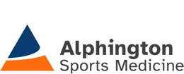
With the majority of our building redevelopment work done & (hopefully) the worst of COVID-19 in the past, we've given ourselves a belated 40th Birthday present - a brand refresh, including a new logo!
You'll see this being rolled out gradually, but its already on our Social Media channels and website, plus our new uniforms that you’ll see some staff & practitioners wearing soon. Updates to our external signage will be completed with the final stage of the redevelopment project (work on the front of the building / Heidelberg Rd side of the property).
So what’s changed?
The name:
The building redevelopment meant we combined all our services into the one location at 339 Heidelberg Road and we no longer had the need for two names - Alphington Sports Medicine Clinic and Alphington Exercise + Rehabilitation Centre.
So, with this consolidation, we’ve gone back to the company’s original name and are now simply known as ALPHINGTON SPORTS MEDICINE!
The logo:

We wanted a simple, clear, and sophisticated design to complement our new facilities.
The Logo Mark emphasises “A” of “Alphington” but there is much more to it . . .
It’s an abstract symbol that contrasts the static, stability of the triangle shape intersected by a dynamic, curving movement.
The curve is uplifting and opens up. It is expressive of human movement in sport.
The triangle is suggestive of a mountain. A positive image of a challenge, a goal, or an obstacle to be overcome - something we want to help our patients to achieve.
Typeface:
The typeface used in our new logo is Atkinson Hyperlegible [https://brailleinstitute.org/freefont].
It was developed by the Braile Institute for maximum legibility and is named after Braille Institute founder, J. Robert Atkinson.
What makes it different from traditional typography design is that it focuses on letterform distinction to increase character recognition, ultimately improving readability.
Colours:
The previous blue and orange were well known and have been associated with our company for many years. Without steering too far away from these we wanted to modernise things a little.
The orange has remained the same, but we now have a deeper blue with it - a Deep Ocean Blue that represents a sense of calmness and tranquillity along with strength and trust. It also ties in with the blue you will see on our beautiful feature (staircase) wall and in some other areas of the redeveloped Clinic.


